Saturday, February 28, 2015

Vue project 1009

I like the original cover this week. The drawing, by Jill Stanton, is fun and gets across the subject matter. The logo looks great just knocked out of that black background.

I think the only place for improvement is the traffic jam of type at the bottom. The changing of the background for the K-Cup headline is a good start. Perhaps the bottom headlines could be on a different color background, too. On my redesign, I've tweeked the color on the main headline, but I like the original treatment quite a bit.

My logo is in Avenir Condensed. It's really the current Vue logo with a different typeface and the contrast between bold and light cranked up some more.


Sunday, February 22, 2015

Vue project 1008

Another pretty nice publicity shot. I decided to put it on pure white (of course) play with the shadow a little bit. The original cover has the right idea, but I don't think the design gets there.

An additional element in the mix with the "Pedway Dungeon Crawl" highlighted. The way it's treated on the original covert really fights with the dancer image. I separated them a little more both in space and by color treatment -- hopefully keeping the emphasis on the main image.

Both I and the original cover designer reworked the actual Pedway sign. We both interpreted "Dungeon." The designer of the original cover added Converse Hi Tops and monster feet. I made the Pedway logo's pants a little more ragged.

Logo using another of my favorite fonts, Dom.


What the actual Ped Way street sign looks like:


Update: I've put a more realistic newsprint background on my design.


Vue project 1007

The color of the newsprint is your friend.

A great publicity photo to work with. I put the subject on a white background. To give the photo more punch, I downplayed the headline and logo type.

Hey, it says "Diva" and "Full Frontal" right there in the headline, so I put a tint on the subject's lips and nipples. I'm playing along. I also made the black and white photo just black -- no four-color tint. It's sharper that way and the red tint jumps out better.

(I took the original photo off the Vue Weekly website, so my mock-up pops more than usual.)

This logo treatment is very plain. But I think it could work.


 Update: I've put a more realistic newsprint background on my design.


Vue project 1006

To illustrate this cover headline, I like the idea that the original designer came up with: Showing different races in small segments. But I'd do it differently. Perhaps closeups of different hair types (maybe not). Or different skin complexions (maybe not). Or how about eyes -- since beauty is in the eye of the beholder. Or something.

My illustration could use a little polish, but I think the eye thing is working pretty well with the headline.

The logo is lifted from another, very well-designed logo -- Variety. Hey, they really make the "V" sing out.


Update: I've put a more realistic newsprint background on my design.


Vue project 1005

I liked this cover. I wouldn't do anything to change it.

Nice job dressing up the provided photo. And I like the type treatment, too. It's all a little bit everything and the kitchen sink, but I think it works.

I didn't collect one off the newsstand, so I have no photo of the original issue.


Vue project 1004

"Death from Above 1979" is a powerful name for a band. And the elephant nose thing that they use for their logo is a pretty powerful image.

Again, rather than dressing it up, I stripped it down to what I see as the essence. I just used the logo. "Death" really big in a headline is a grabber, so I grabbed.

Using Knockout and Univers for the headline treatment.

Going a little nuts with emphasising the "V" in Vue. It's a very similar treatment to the one that is used on the real publication. Univers and everything.


Update: I've put a more realistic newsprint background on my design.


Vue project 1003

Using provided photography can be a pain in the neck. Sometimes you just have to use it and go on. I think the designer did a fine job here, but the subhead and the headlines at the bottom are in conflict. The original designer dealt with it by putting the main head and subhead on a slant. I separated the education head completely -- made it look like a special section or something special.

As for the logo, it's another kind of retro look. The typeface is Ribbon and it could not look more 1950s. I like it.

Also upped the sepia tone on the photo and used cowboy-ish type for the headline treatment.


Update: I've put a more realistic newsprint background on my design.


Vue project 1002

Getting into Rockwell type on this one.

And simplifying again. Well -- that's my schtick.

Can't go wrong with an International No Symbol. Thought the symbol was strong enough to not use a headline and just go for a subhead.

Swiped a photo off the Internet for the bread. Don't know what kind of photography budget there is for Vue Weekly, but I'd hope there would be a couple dollars to cover a stock photo.

Going big for the white space. I maintain that white is the best color for most of a printed cover. It's the brightest color you can get, so I might as well use it.


Update: I've put a more realistic newsprint background on my design.


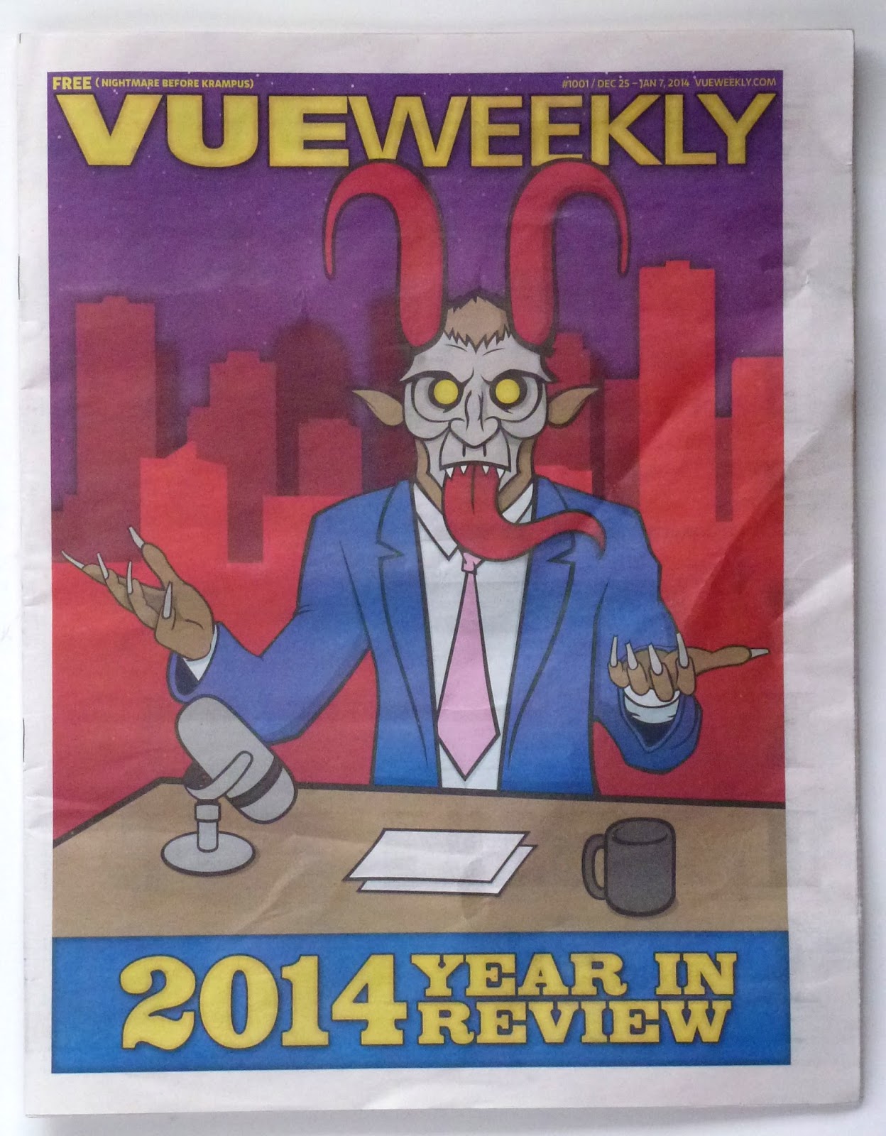
Vue project 1001

"Year in Review" issue for some reason features Krampus.

Okay -- I'll just go with it.

Not sure about the late-night host/Krampus combo, so I just made it focus on Krampus alone.

Kinda liking this logo. The type is so big it almost doesn't read as a word.


Update: I've put a more realistic newsprint background on my design.


Saturday, February 21, 2015

Vue project 1000

By reworking the covers of a local publication, I admit I'm being a bit of a jerk.

But I have this urge to design some stuff. So, off I go. These designs are for educational purposes only.

The logo of the Vue Weekly presents some serious design challenges. Just three letters in the main part of the logo (VUE). And they are difficult letters. On this one I go sliding into the retro-rounded letters. Every letter has a curve -- except for the "V." Sorta works.

The current covers are all staff illustrated, with some publicity photos tossed in. Having to do the paper and do the cover illustration at the same time? That's a heavy load.

I really liked the unicorn in the original illustration so I took made it the star of the cover, And I rewrote the headline to play up the rarity of the one thousand mark -- and the unicorn. With a possibly obscure reference to "The Outsiders" that maybe no one will get.


Update: I've put a more realistic newsprint background on my design.